Making local discovery personal.
Google Maps shows you what's popular, not what you'd actually like.
Google Maps is incredible for getting around. But when it comes to finding where to eat, drink, or explore, it has a big blind spot: it shows you what's popular, not what's good for you.
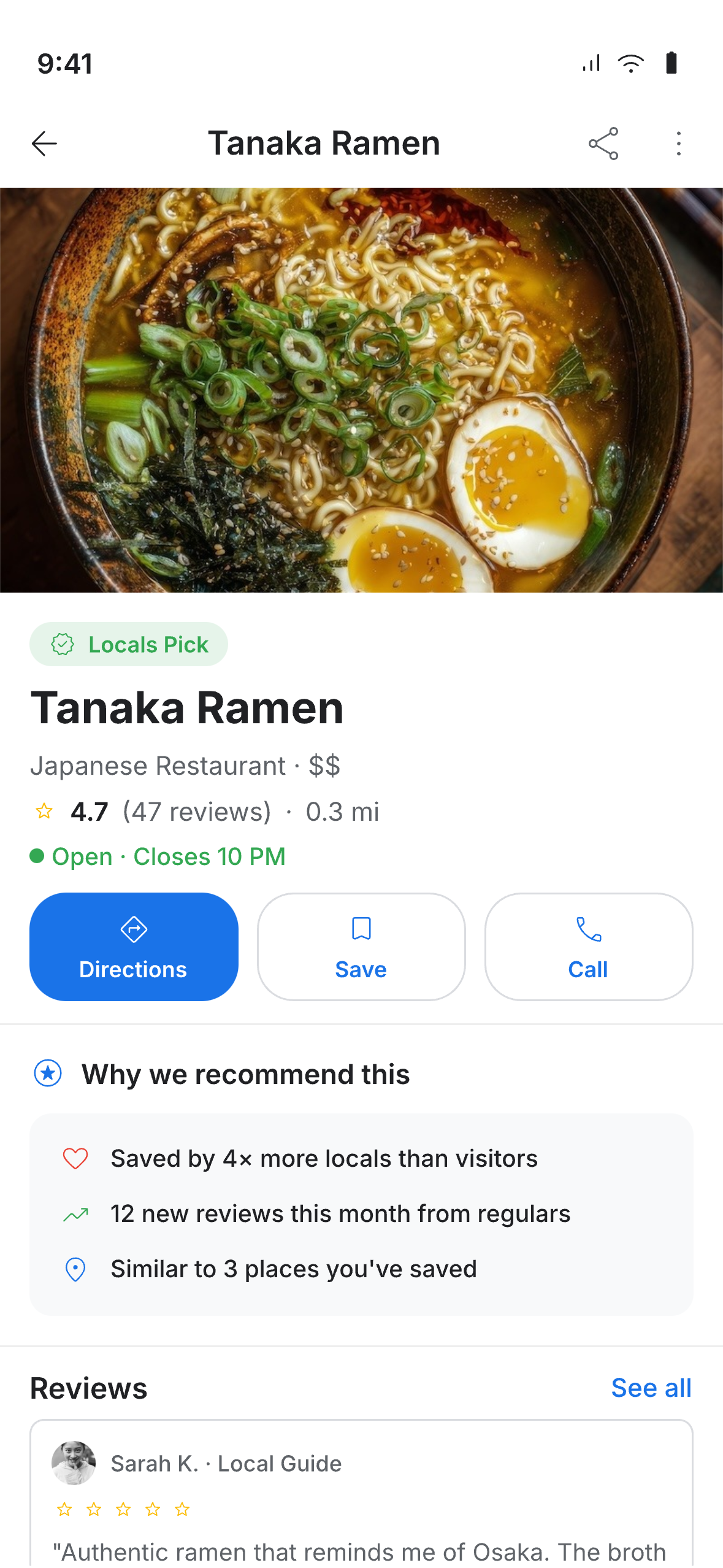
The Explore tab pushes places with the most reviews and the broadest appeal. That means chains, tourist traps, and safe bets take over — while the amazing ramen spot with 47 passionate reviews gets buried under a Starbucks with 3,000.
If you actually know what you like and you're looking for something specific, Maps is basically useless for discovery. You open Explore, scroll, find nothing relevant, and close the app. Every time.
"The algorithm gives me the same 10 restaurants every time. I've stopped looking."

Maps has the data. It just doesn't use it well.
I looked at how other apps handle this — Yelp, Foursquare, The Infatuation, and Google's own Local Guides. I wanted to understand how each one signals whether a place is actually worth going to, and where Maps falls short.
Yelp relies on review volume. Foursquare used to use check-ins. The Infatuation uses editors. None of them use your actual behaviour as the main signal — and that's the opportunity.
I also went through a bunch of Maps reviews on the App Store. The pattern was clear: people love Maps for directions but treat it as a last resort for finding places to go. That gap between navigation and discovery is the whole problem.
| Platform | Signal Type | Personal? |
|---|---|---|
| Review volume + star rating | ||
| Review volume + recency | ||
| Check-in frequency | ||
| Editorial curation | ||
| Behavioral signals + saves + local engagement |
More reviews = safer recommendation for Google. But "safe" and "actually good for you" are two very different things.
Frequent travellers skip Maps entirely for finding places — they use The Infatuation, Instagram, or just ask locals. Maps has lost credibility for recommendations.
People save hundreds of places but Explore never uses those saves to shape what it recommends. The data is right there — it's just not being used.
Two users, one discovery gap.
I focused on two types of people who use Maps for discovery. Both are being let down, just in different ways.
The Local Explorer (25–38) — Avoids chains. Knows what they like. Gets recommendations from Instagram and friends, not Maps. They'll open Explore sometimes but never find anything they'd actually go to. What they need: places that match their taste, not just what's popular.
The Cautious Visitor (38–55) — Travelling for work or fun. Wants to eat local but doesn't want to risk a bad meal. Relies on high review counts because that's all they have to go on. Keeps ending up at tourist traps. What they need: a way to know what the locals actually go to.

The Local Explorer
Goals
- Find hidden gems, not tourist traps
- Discover based on personal taste
- Trust recommendations from locals
Pain Points
- Explore shows the same chains every time
- Uses Instagram instead of Maps
- Saves hundreds of places, none influence feed

The Cautious Visitor
Goals
- Eat local while travelling
- Find reliable, quality restaurants
- Avoid tourist traps with confidence
Pain Points
- Relies on high review counts as proxy for quality
- Gets trapped in the tourist bubble
- No way to distinguish local vs. tourist reviews
Three ideas, one clear winner.
I came up with three different approaches:
Direction A: Mood Filter — Let people set a vibe (date night, solo adventure, quick bite) to filter the Explore feed. Simple to build, but makes the user do all the work and doesn't get smarter over time.
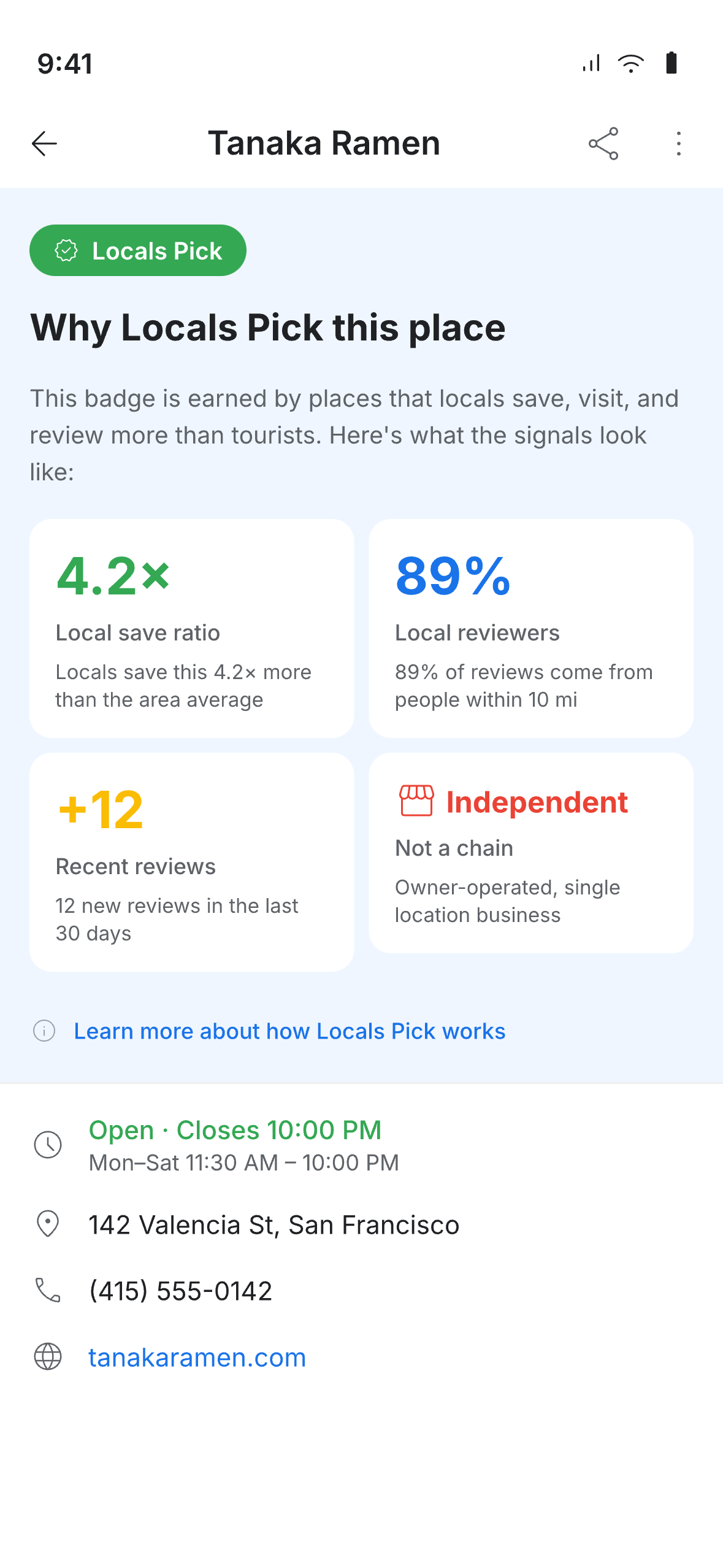
Direction B: Locals Pick Badge — A new badge that highlights places locals actually go to, based on real engagement signals instead of review volume. Works automatically, no setup needed.
Direction C: Time-Aware Feed — Rearrange Explore based on time of day and where you are (morning = coffee, evening = dinner nearby). Clever idea, but complicated to build and easy to get wrong.
"The badge just works — no profile setup, no personalisation needed, and both types of users get it instantly."
I went with Direction B because it hits the sweet spot between impact and buildability. The Locals Pick badge doesn't need any setup from the user, works everywhere, and fits right into Google's existing design system. It also pairs nicely with parts of Direction C for rearranging the feed.
I defined what makes a place qualify: recent reviews from regulars, not a chain, high save rate relative to visits. The badge itself fits into Google's existing design language — proper colours, icon, accessible contrast.
Redesigned the cards to lead with why a place was recommended. Added a "Why Locals Pick This" section in the detail view so you can see what earned the badge — no black box.
Rearranged the Explore feed so Locals Pick shows up first, with contextual groups below. Took raw review counts off the cards — the focus is now on why a place is worth visiting, not how many reviews it has.
3 new components that fit into Google's existing design system: the Locals Pick badge, a recommendation chip, and a discovery section header. All documented with usage guidelines and accessibility covered.
The designed experience.

A new feature that doesn't need new tech.
What I like about this project is that it doesn't require Google to build anything new from scratch. The Locals Pick concept works with data Google already has and fits into the design system they already use — it's just using what's there in a smarter way.
The most useful outcome was probably the three new components. They're fully compatible with Google's design system, accessible, and documented — ready to go if someone at Google ever wanted to run with it.
What I'd Do Differently
I'd spend more time testing the badge criteria against real Maps data before getting into the visual design. The logic behind what qualifies needs data science input — the design part is the easy part.