Designing clarity for chronic condition users.
Apple Health knows everything. It explains nothing.
Apple Health tracks more health data than any other consumer app out there. Heart rate, blood oxygen, sleep, blood glucose, blood pressure, activity — all tracked, all stored, all shown in charts. But showing you charts isn't the same as telling you what they mean.
For people managing chronic conditions — diabetes, high blood pressure, heart disease — this app is part of their daily routine. They open it every morning, look at the numbers, and close it without really knowing if today's a good day or a bad day.
Apple Health shows you data. It doesn't explain it. For the people who need it most, that gap between seeing numbers and understanding them is the whole problem.
"I check my numbers every morning but I still don't know if I'm doing okay."
It calls itself a health companion. It's really a spreadsheet.
I started by going through Apple's own design guidelines for Health & Fitness. Apple describes Health as a "personal health companion." Right now it's more like a personal health spreadsheet.
I looked at what Oura, Whoop, Garmin Connect, and Google Health Studies are doing. The pattern was obvious: every competitor that got better reviews moved from showing charts to telling you what the charts mean. Oura's "Readiness Score" and Whoop's "Recovery" number both take complicated data and boil it down to one thing you can understand.
I went through 300+ App Store reviews and the same complaint kept coming up: "I have all this data but I don't know what it means." People don't want more data — they want someone to tell them what it means.
| Platform | Signal Type | Narrative? |
|---|---|---|
| Readiness Score · Single daily number · Plain language | ||
| Recovery % · Strain tracking · Coach insights | ||
| Body Battery · Training status · Recovery advisor | ||
| Raw charts only · No interpretation · No daily score |
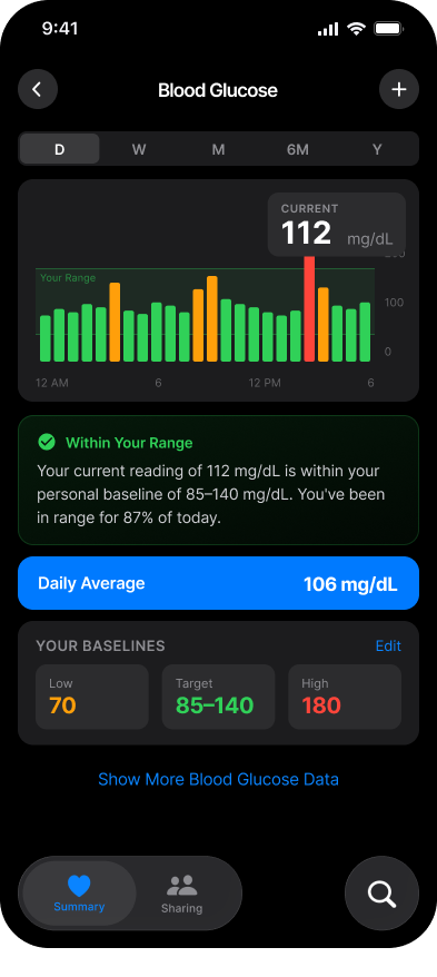
People with chronic conditions don't need more charts — they need to know if their numbers are okay. A blood pressure of 138/88 doesn't mean anything if you don't know what's normal for you.
Oura, Whoop, and Garmin all started leading with simple summaries instead of charts. Google Health Studies does it too. The whole industry has moved on — Apple hasn't.
The app uses alarming red colours on data that isn't actually alarming. People with high blood pressure say the app makes them feel worse, not more informed. Colour should mean something, not just look scary.
Two people. Very real stakes.
Jamie, 44, has Type 2 diabetes. Opens Apple Health every morning. Tracks with an Apple Watch and checks blood glucose with a Libre sensor. The one question Jamie has every day: "Am I doing okay or do I need to be careful?"
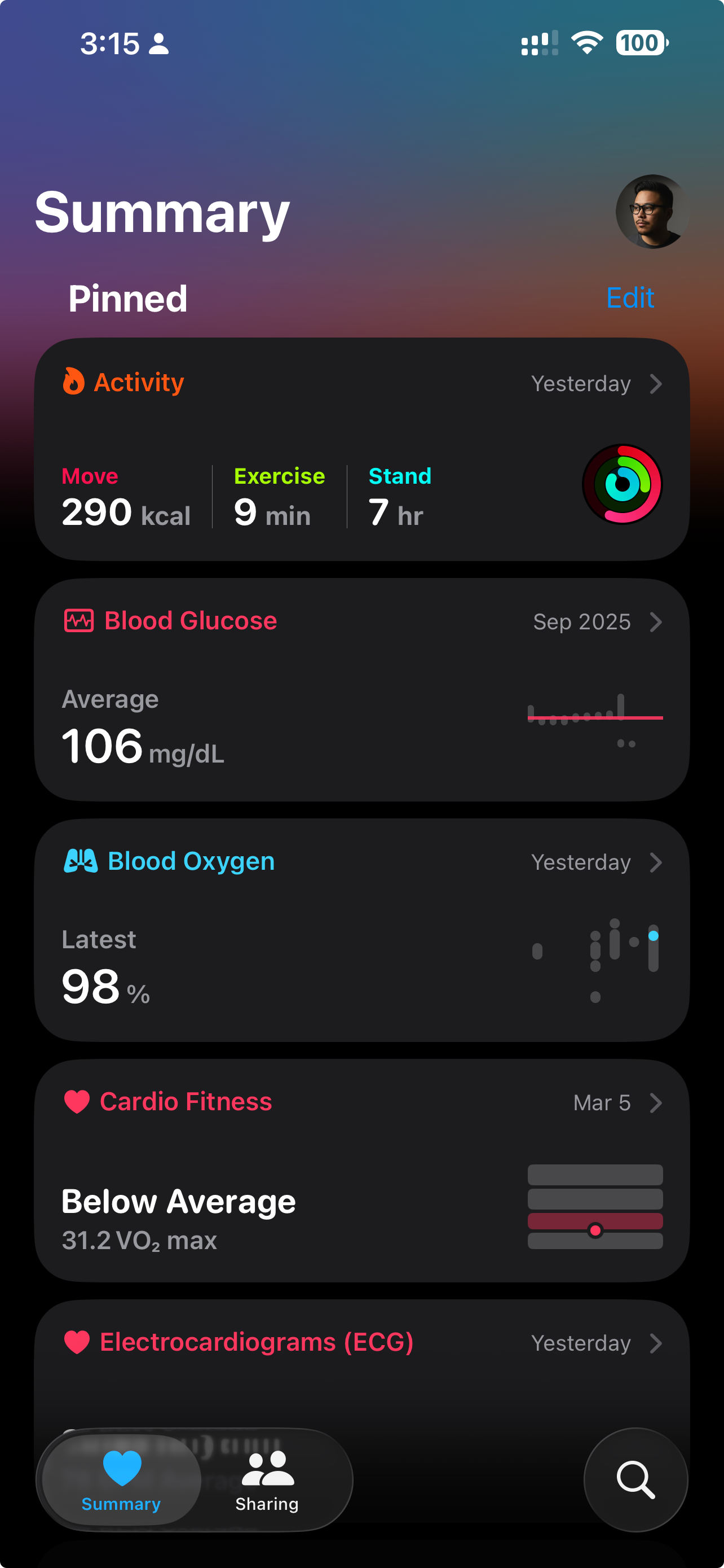
Jamie doesn't want more data. Jamie wants one screen that says: you're on track, or you're not — and if not, here's one thing that might help. Right now the app shows Jamie 14 different metric cards. Not a single one answers the question.
The other group: Retirees (60–75) recovering from heart issues. Their doctor told them to "track their numbers." They do, religiously — but they have no idea what the numbers actually mean. They want reassurance, not complexity.

Jamie

Retirees
Following Apple's rules, then going further.
I explored three different approaches to bridging the gap between seeing data and understanding it:
Direction A: Daily Summary Card — A new main screen that tells you how you're doing in plain language. "Your sleep was good. Blood glucose is in your normal range. Activity is a bit low today." One screen, one glance, you get it.
Direction B: Personal Baseline Cards — Redesigned metric cards that show your personal normal range, not the average person's. A reading that looks "low" for most people might be totally normal for Jamie. Your numbers, your context.
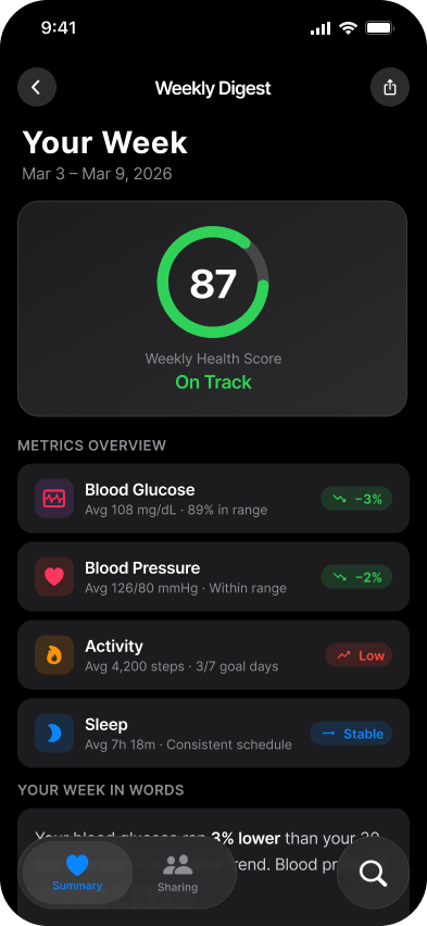
Direction C: Weekly Summary — A once-a-week recap that spots trends and suggests small actions. "This week your blood glucose was 8% higher than your usual. Your evening walks helped — maybe squeeze in one more this week."
"It's not one screen — it's layers. Quick summary for the morning check, detail when you're curious, weekly recap when you want the bigger picture."
I ended up using all three ideas as layers: Daily Summary (quick morning glance) → Personal Baseline Cards (when you want the detail) → Weekly Recap (for the bigger picture). Each layer fits a different moment and how much time you have. Together, they actually help you understand your health.
A morning screen that tells you how you're doing in plain language — not just what your numbers are. Colour only shows up when it actually means something.
Colour that means something — only used when a number is actually outside your range. No false alarms, no unnecessary anxiety.
Your normal range, not the average person's. "Within your range" replaces raw numbers that don't mean much on their own.
Three new components — Summary Card, Range Indicator, Trend Chip — all built to fit Apple's existing design system with full documentation.
The designed experience.

A health app that tells you what your numbers mean so you don't have to guess.
This project showed me that Apple Health's problem isn't a data problem — it's a design problem. The data is all there. The smarts are all there. What's missing is the part that turns raw numbers into something a person can actually understand.
The layered approach (Summary → Detail → Weekly Recap) works for people with different amounts of time and different anxiety levels. The calmer colour system stops the app from scaring people unnecessarily. And all the new components use Apple's own design system — no external fonts, no custom colours, nothing that breaks the rules.
What I'd Do Differently
Red means different things in different cultures, and with health data that matters a lot. I'd want to do more research on that before locking in the colour system, especially for something as global as Apple. Also, the plain-language summaries are basically health advice — "a short walk would help" crosses a line that would need medical and legal review before shipping.